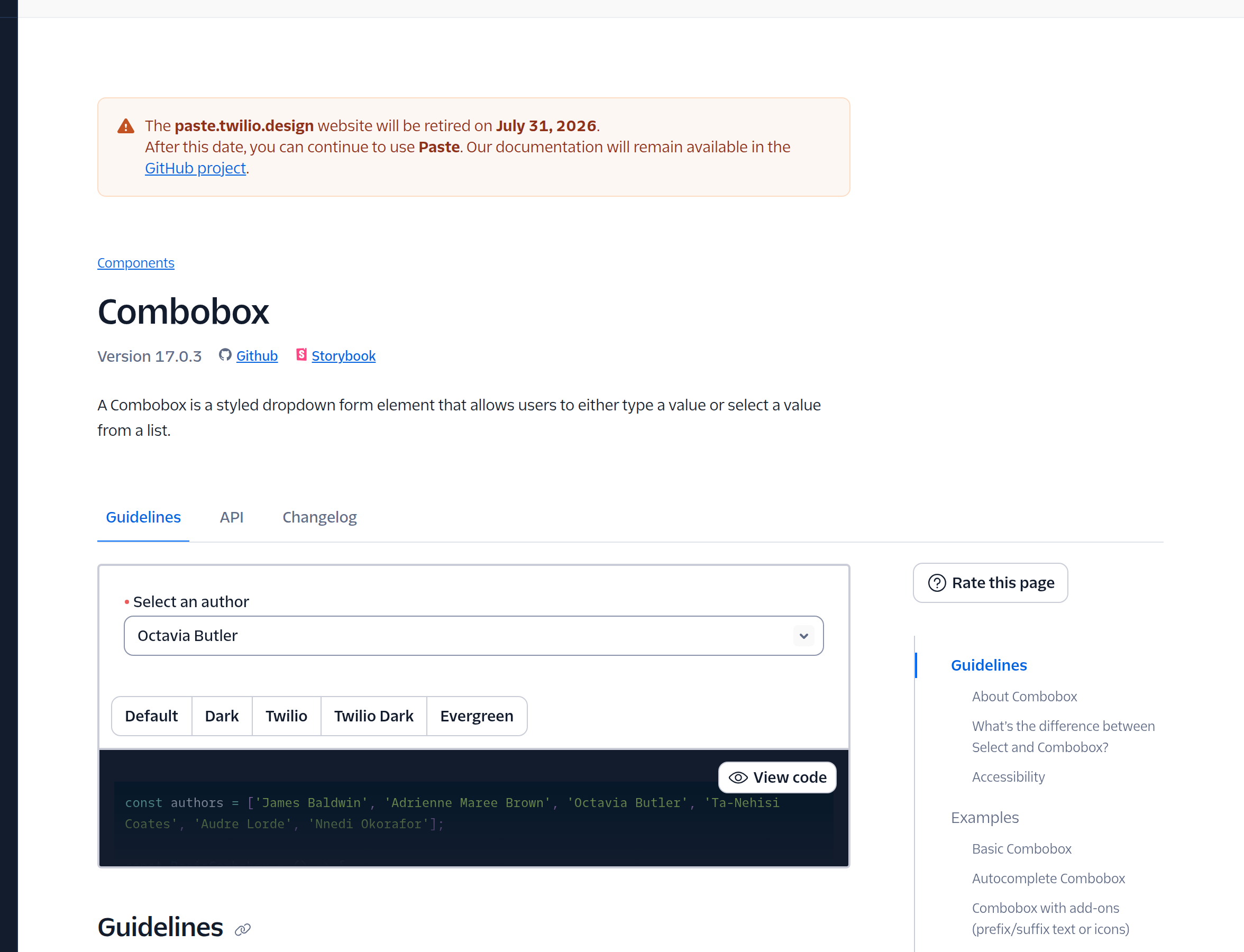
From native select to searchable, multi-token comboboxes. The component with the widest gap between a naive build and a production one.

Multi-level dropdown for hierarchical selection (region pickers, taxonomies).
Read the Ant Design breakdown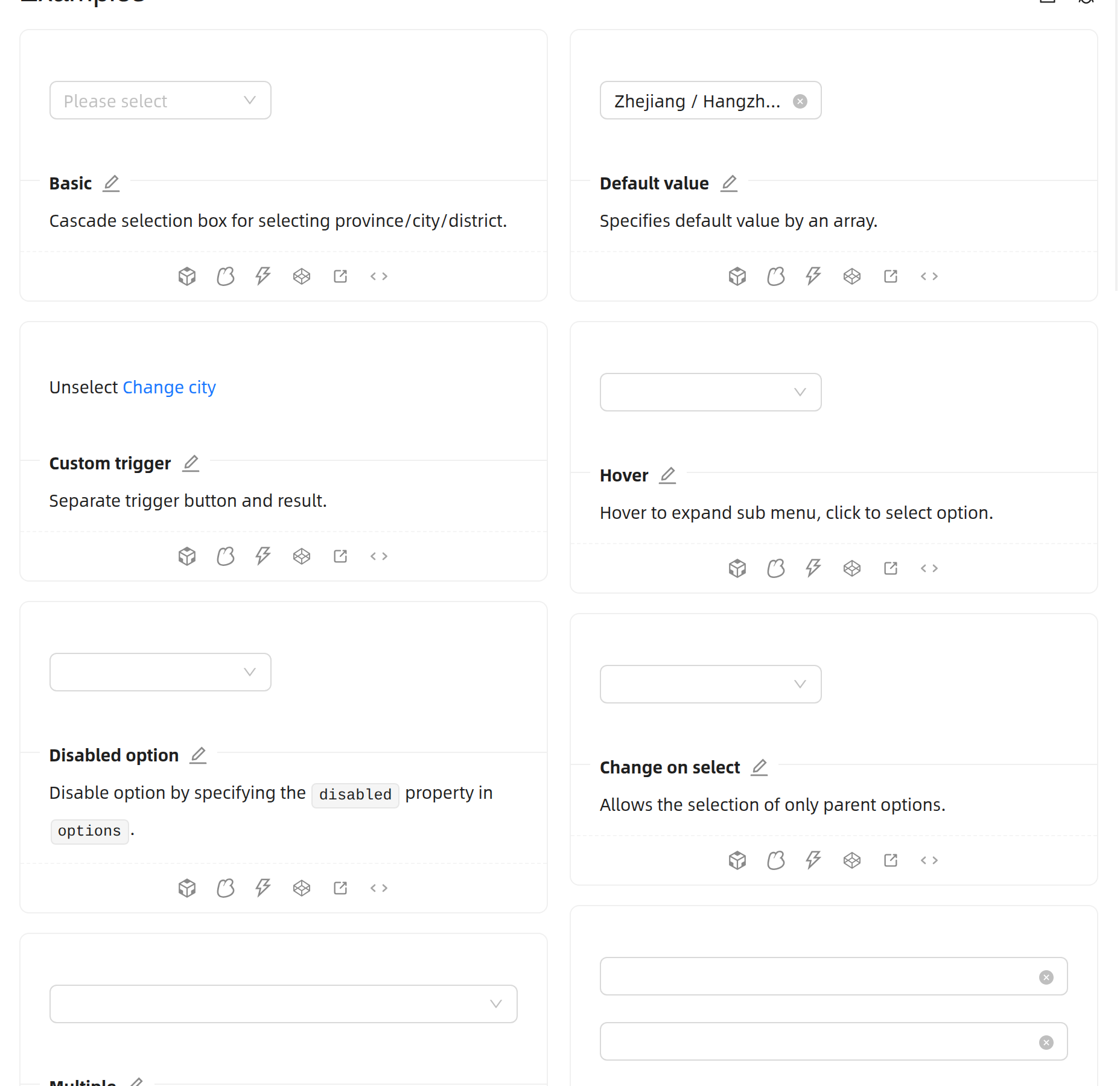 Open docs
Single- or multi-select searchable dropdown with an aria-busy loading state and chip-based display of selected values in multi-select mode.
Read the Designsystemet breakdownThe reference implementation for enterprise select-with-search patterns.
Read the Lightning Design System breakdown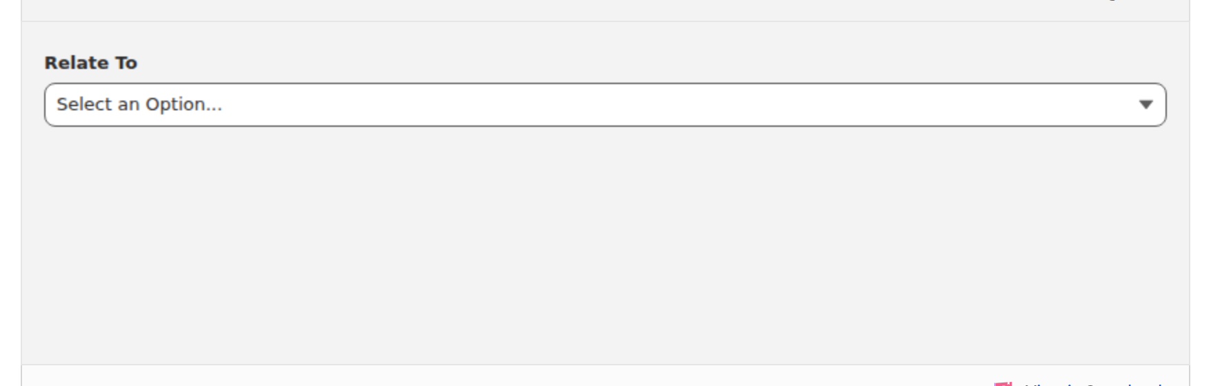 Open docs
Async, multi-select, keyboard-accessible with virtualization built in.
Read the MUI (Material UI) breakdown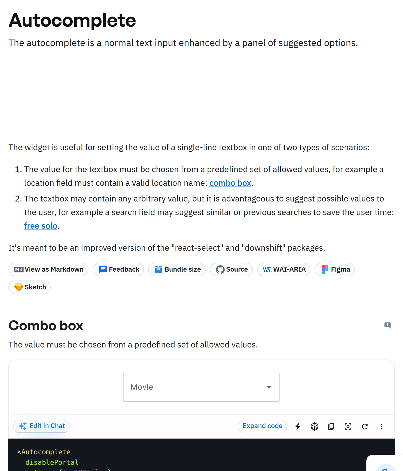 Open docs
A custom-styled native <select> element rather than a JS-driven listbox, preserving native keyboard and screen-reader behavior.
Read the New Zealand Government Design System breakdownAccessible select with searchable, scrollable, and grouped variants.
Read the Radix UI breakdown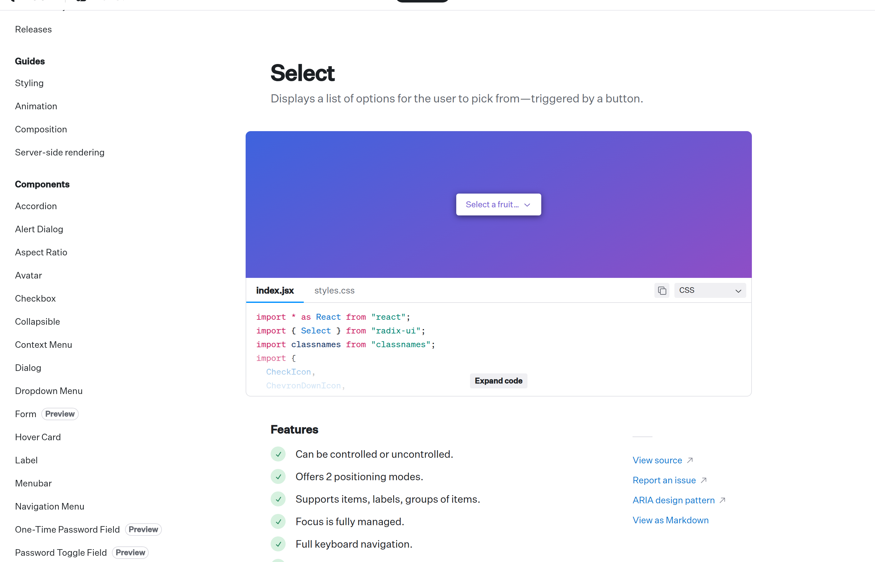 Open docs
Searchable select with async loading and accessible keyboard model.
Read the Spectrum breakdown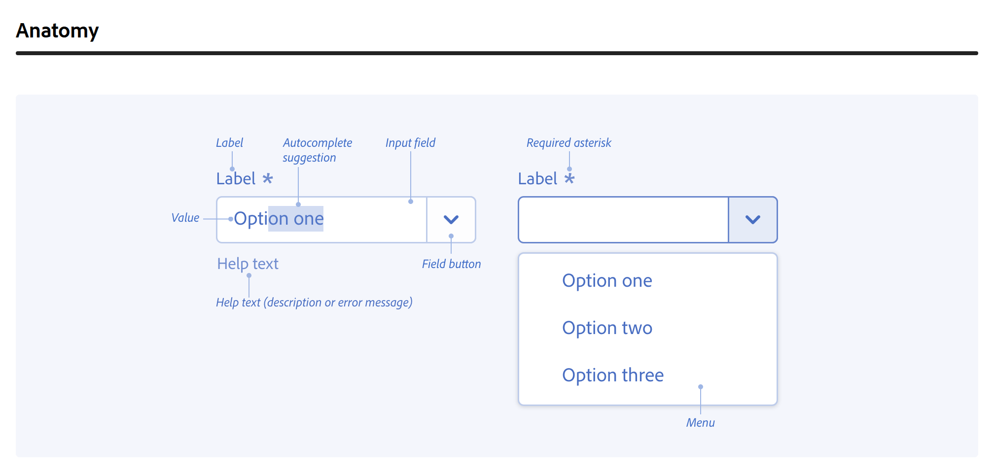 Open docs