The universal container — and the component most likely to fork into domain variants (listing cards, fare cards, deployment cards).
Photo-led card with title, location, price, rating, and date-aware availability state.
Read the Airbnb DLS breakdownSearch-result card showing flight or hotel detail with airline/chain branding, price in user-locale currency, and inline ratings.
Read the Backpack breakdownThe reference content-card pattern for editorial sites — title, image, kicker, summary.
Read the BBC GEL breakdown
Composable surface with selectable, expandable, and clickable variants.
Read the Carbon breakdown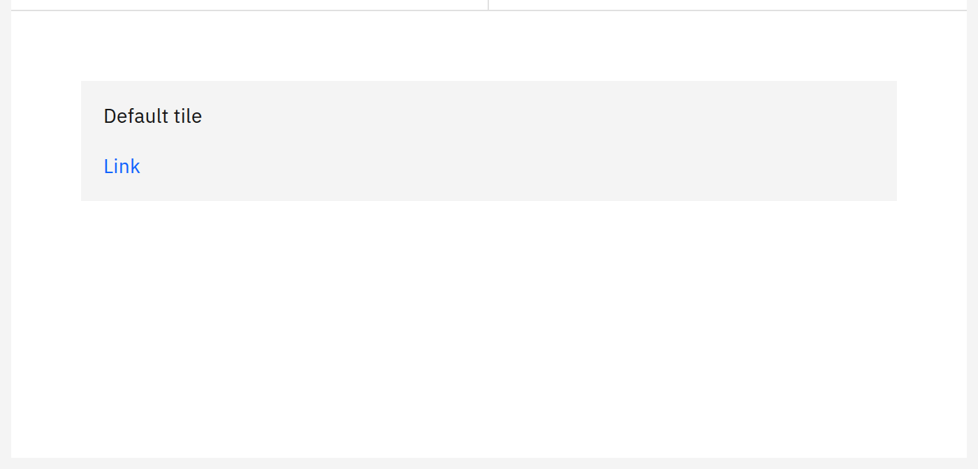 Open docs
Selectable file representation with preview, action overflow, and shared-with avatar stack.
Read the Dropbox Design breakdownDense product card with image, title, price, condition, and seller signal — works in lists and grids.
Read the eBay Evo breakdown
Status, commit, branch, region, and timing in a dense card — the reference pattern for any list of long-running operations.
Read the Geist breakdownComposable disclosure container used for filter rails and side panels.
Read the Gestalt breakdown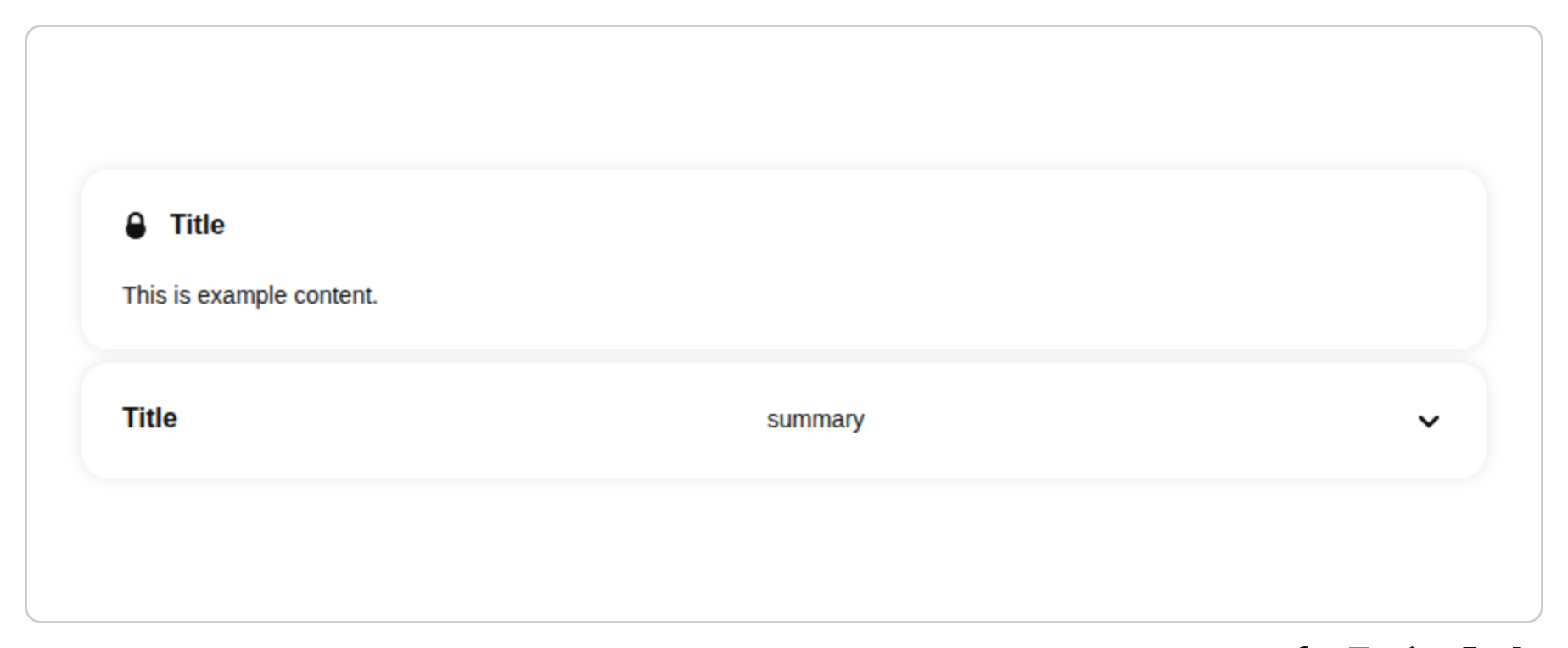 Open docs
Three card variants (elevated, filled, outlined) that map to information hierarchy.
Read the Material 3 breakdown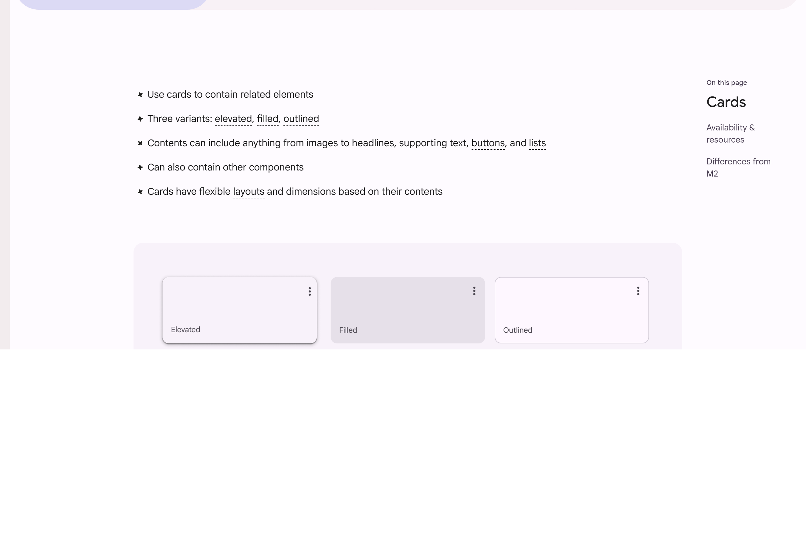 Open docs
Severity-tagged content panels (information, warning, urgent) for medical content — the reference for content with safety implications.
Read the NHS Design System breakdown