
01 / Anatomy
What a design system contains
Five layers, each building on the one below. Teams that skip a layer pay for it later — usually at the governance end. Here's what those layers actually look like, rendered:
| Layer | What it is | Example |
|---|---|---|
| Design tokens | Named design decisions — color, type, spacing, radius — stored as data, not baked into mockups. | color.action.primary = oklch(0.55 0.16 255) |
| Components | Coded, reusable UI parts with defined props, states, and accessibility built in. | Button, Input, Modal, DataTable |
| Patterns | Larger compositions that solve recurring product problems the same way every time. | Empty states, form validation, confirmations |
| Guidelines | The written rules: when to use which component, content voice, accessibility standards. | "Use a modal only for blocking decisions" |
| Governance | How the system changes: who decides, how teams contribute, how releases are versioned. | RFC process, semver releases, deprecation policy |
Each layer has a full guide in our foundations section — color, typography, spacing, accessibility, and design tokens.
02 / Disambiguation
Design system vs style guide vs component library vs UI kit
These terms get used interchangeably. They shouldn't be — the differences decide what your team actually ships.
Style guide
Visual rules you read — colors, typography, logo usage. No code, no components, no tokens. A subset of a design system.
Component library
The coded UI parts — installable, versioned. No design guidance, no governance. The engine without the manual.
UI kit
Design-tool assets (Figma libraries) for producing mockups. Design-side only. Nothing ships to production from a kit alone.
Design system
All three, connected: tokens + components + patterns + guidelines + governance. Not a project that finishes — a product that serves other products.
03 / Examples
What the best design systems look like
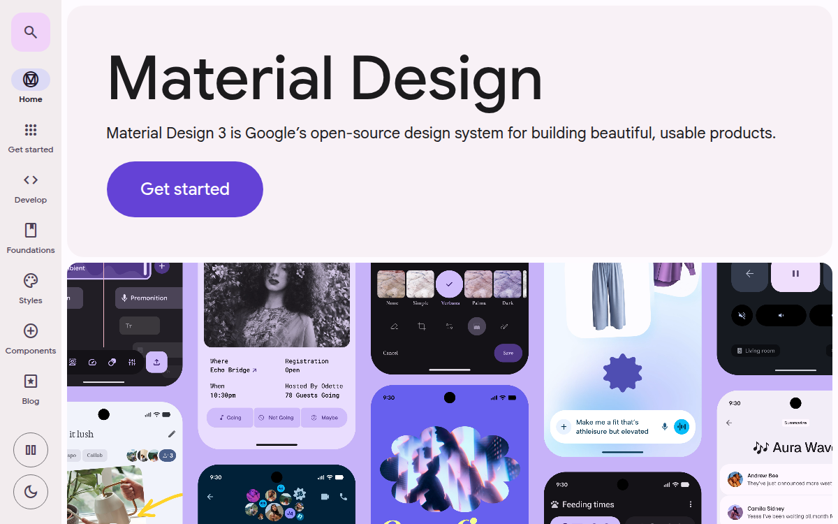
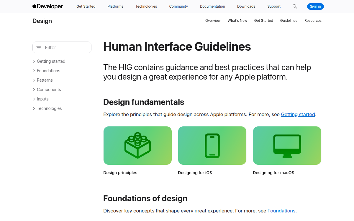
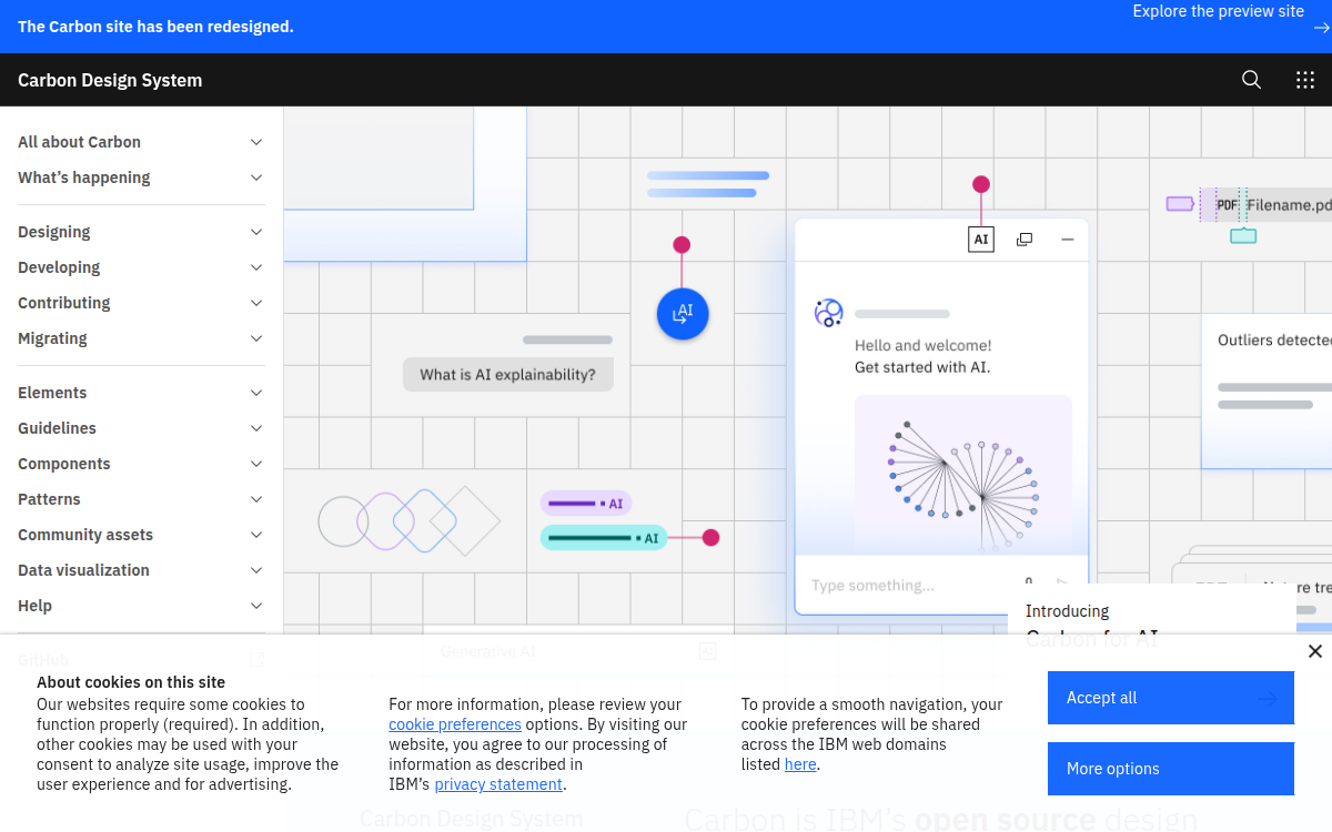
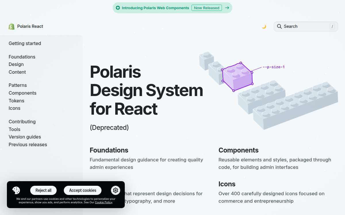
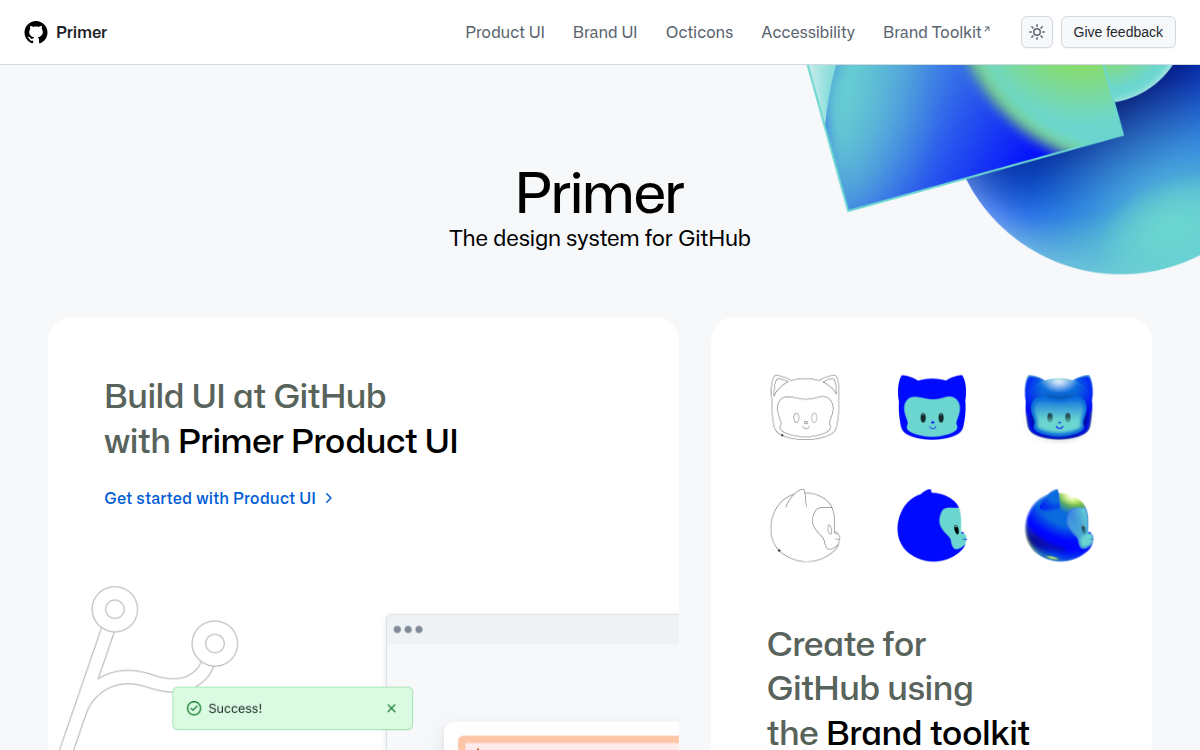
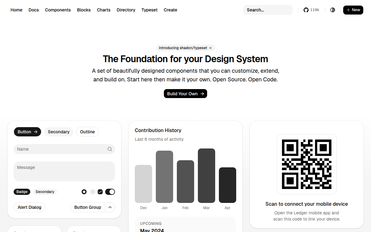
The canon: Google's Material Design, Apple's Human Interface Guidelines, IBM's Carbon, Shopify's Polaris, GitHub's Primer, and the developer-era outlier, shadcn/ui. Each solves the same problem — consistency at scale — with visibly different trade-offs.
Our catalogue holds 120 design systems — enterprise, open-source, government, and startup — 49 of them with full editorial breakdowns: governance model, what each system is known for, what's underrated, and what to watch out for before adopting it.
04 / Why and how
Why teams build one — and how to start
The economics are simple: without a system, every team re-solves buttons, forms, and date-pickers — and re-introduces the same accessibility bugs. With one, those decisions are made once and reused everywhere. You can put numbers on that trade-off with our ROI calculator.
Building one is a 90-day arc, not a two-year program: orient, ship the token spine, build the ten components that cover 80% of screens, document as you go, then establish governance before scale breaks you. The full sequence is our free eight-chapter playbook.
05 / The 2026 shift
Design systems now have a second audience: AI agents
Cursor, Claude Code, and v0 already write production UI. A design system agents can't read gets bypassed — they invent color="dark-blue-2" instead of using your tokens. Machine-readability — MCP, llms.txt, W3C Design Tokens — is becoming as load-bearing as visual consistency was in the last decade.
06 / Common questions
Frequently asked questions
What is a design system in simple terms?+
A design system is a shared library of reusable parts — colors, type styles, spacing values, components like buttons and forms — plus the written rules for using them. Every screen a team ships ends up looking and behaving the same way, without redesigning the basics each time.
What is the difference between a design system and a style guide?+
A style guide documents visual rules (colors, typography, logo usage) — it's a reference you read. A design system includes a style guide but adds working code: design tokens, coded components, patterns, and governance. A style guide describes; a design system ships.
What is the difference between a design system and a component library?+
A component library is the coded UI parts alone — buttons, inputs, modals. A design system wraps that library with design tokens, usage guidelines, accessibility standards, content rules, and a process for evolving it all. Every design system contains a component library; not every component library is a design system.
What are the best examples of design systems?+
The most-studied design systems include Google's Material Design, Apple's Human Interface Guidelines, IBM's Carbon, Shopify's Polaris, Atlassian's Design System, GitHub's Primer, and shadcn/ui. Our gallery catalogues 120 real-world design systems with editorial breakdowns of the decisions behind them.
How long does it take to build a design system?+
A usable first version — tokens, five to ten core components, and documentation — takes a small team roughly 90 days. Mature systems are never finished: they evolve with the product. Our free playbook lays out the day-1-to-day-90 path chapter by chapter.
What makes a design system AI-ready in 2026?+
Five signals: an MCP server agents can query, an llms.txt entry map, tokens in the W3C/DTCG format, a CLI-installable component registry, and published Figma Code Connect mappings. We benchmark 37 major systems against exactly these signals in the Agent-Ready Index, re-audited quarterly.