The components only one system ships — domain-specific pieces (campaign builders, vehicle configurators, triage inboxes) that show what a design system looks like when it grows past the generic kit.
Vector glyphs that align with text baselines, scale with Dynamic Type, and ship in nine weights and three scales.
Read the Apple Human Interface Guidelines breakdown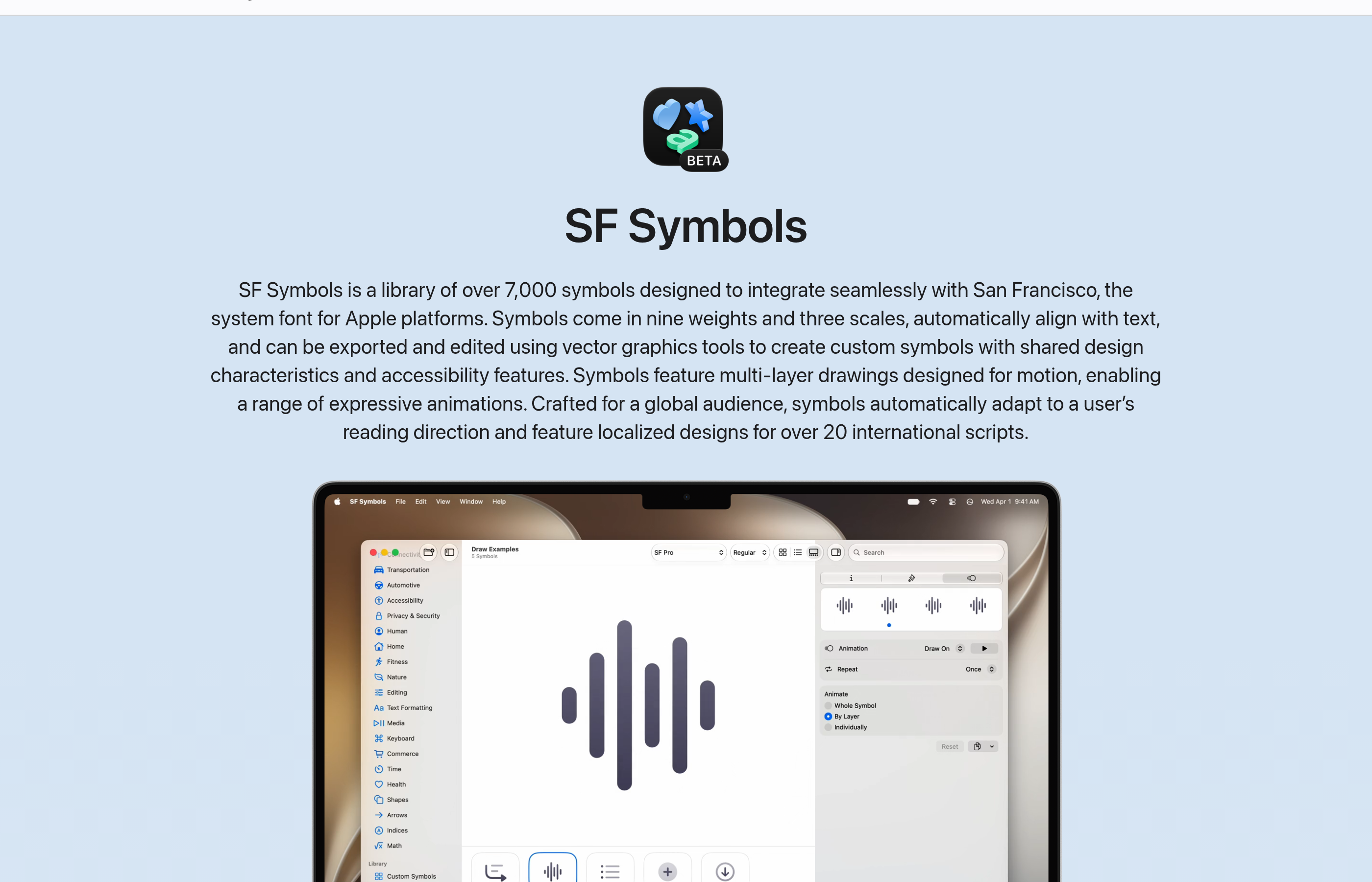 Open docs
Modular rich-text editor with mentions, commands, and collaborative editing primitives.
Read the Atlassian Design System breakdownStepwise option picker with live render, conflict resolution between trims, and persistent price summary.
Read the Audi UI breakdownRenders a list of form validation errors above a form, per WCAG's error-summary pattern; ships as both React and a ds-error-summary custom element.
Read the Designsystemet breakdownTypeahead/autocomplete component that the library's own docs mark as the successor to the deprecated Combobox component.
Read the Designsystemet breakdownCookie-consent banner component taking required heading, message, accept-button, and decline-button text as parameters.
Read the DKFDS breakdownMulti-step flow navigation listing steps with active/disabled/error states and per-step help text, with a companion variant that collapses at a chosen breakpoint.
Read the DKFDS breakdownLabel/value summary table with an optional per-row edit link and a configurable breakpoint at which it reflows for small screens.
Read the DKFDS breakdownLive-collaborator avatar group with overflow handling and offline / typing states.
Read the Dropbox Design breakdownAvatar + presence + identity primitive used across Microsoft 365.
Read the Fluent UI breakdown
Syntax-highlighted code with copy affordance, line numbers, and language badge — the canonical code presentation for dev tools.
Read the Geist breakdownEmpty / loading / error patterns specifically tuned for long-running operations and partial data states.
Read the Helios breakdownA command-menu component in the public export list.
Read the Kumo breakdownPublished as @leafygreen-ui/code — a syntax-highlighted code display/editor component.
Read the LeafyGreen UI breakdownPublished as @leafygreen-ui/date-picker.
Read the LeafyGreen UI breakdownInline-editable issue surface with status pill, assignee, labels, priority, and a stream of activity — the dense detail view that other trackers benchmark against.
Read the Linear breakdownKeyboard-first issue triage with bulk actions, status pivot, and timeline scrubbing — sets the bar for queue-style productivity UI.
Read the Linear breakdownMulti-track Gantt with project rollups, milestone diamonds, and zoom levels that snap to week / month / quarter — designed for long-horizon planning without the heaviness of Microsoft Project.
Read the Linear breakdownBranded illustration set with documented usage and themable color.
Read the Mailchimp Design System breakdownMulti-step editor pattern with live preview, save-and-resume, and async send.
Read the Mailchimp Design System breakdown
Product catalog editor for variants (size, color, SKU) with bulk pricing and inline image handling — real e-commerce depth.
Read the Market breakdownShips success/warning/error/info variants distinguished by dedicated border-color tokens.
Read the New Zealand Government Design System breakdownICTU, on behalf of the Ministry of the Interior and Kingdom Relations (BZK)
@utrecht/button-react
The canonical Button implementation in the Utrecht component library, one of the most widely consumed packages in the ecosystem.
Read the NL Design System breakdownICTU, on behalf of the Ministry of the Interior and Kingdom Relations (BZK)
@utrecht/form-field-react
Combines label, input, and validation-message wiring into one accessible form-field pattern, used across government-forms-heavy member sites.
Read the NL Design System breakdownICTU, on behalf of the Ministry of the Interior and Kingdom Relations (BZK)
@utrecht/data-badge-react
A small status/count badge — one of dozens of granular single-purpose packages that make up the library rather than one monolithic bundle.
Read the NL Design System breakdownBranching pipeline graph showing stages, jobs, and status — the canonical reference for any DAG-style workflow visualization.
Read the Pajamas breakdownThe full code-review surface — diff viewer, threaded comments, approval state, CI status. A pattern reference for any review-flow product.
Read the Pajamas breakdownStreaming log surface with search, filter, line-wrap, and download — the canonical infrastructure log UI.
Read the PatternFly breakdownInteractive map of Argentine provinces as a first-class component.
Read the Poncho breakdownPublic holiday data rendered as a component — a genuine government need.
Read the Poncho breakdownEvent and schedule listings for institutional sites.
Read the Poncho breakdownDisplays a DataProvider as cards in a masonry-style grid with equal-width, variable-height columns.
Read the Redwood breakdownRenders a DataProvider as an activity/timeline feed.
Read the Redwood breakdownThe persistent side-navigation list component used across Redwood application shells.
Read the Redwood breakdownA Stencil data table taking fields/rows props, with sorting, multi-row selection, inline cell editing, pagination, and an optional frozen header.
Read the Scale breakdownISO-8601 date input built on duet-date-picker, with configurable min/max range and full localization of button/day/month labels.
Read the Scale breakdownSingle-select combobox with a filterable option list and optional free-text entry via allowCustom.
Read the Scale breakdownFirst-party data visualisation, themed from the same tokens.
Read the Shoreline breakdownA dedicated table package rather than a table component.
Read the Shoreline breakdown33 mappings produced by tooling, so Figma and code do not drift by hand.
Read the Shoreline breakdownA media-platform primitive most enterprise systems have no equivalent for.
Read the Spindle breakdownMobile-first fixed action bar, treated as a first-class component.
Read the Spindle breakdownShips with a Code Connect mapping, so Figma and code agree by construction.
Read the Spindle breakdown
Hero, feature, pricing, FAQ, CTA sections that designers find hard to fault.
Read the Tailwind UI / Tailwind Plus breakdownReact component primitives with a coherent API across Button, Dialog, Form, etc.
Read the Tailwind UI / Tailwind Plus breakdownFirst-party theming tool published with the system, not bolted on.
Read the TDesign breakdownA whole surface class most catalogued systems ignore.
Read the TDesign breakdownMaintained alongside the web libraries rather than as a community port.
Read the TDesign breakdown